Emptiness: How Japanese brands succeed with nothing

When you’re sitting there making your new creatives for your campaign, have you ever thought “Theres so much space, what do I do?” Well, I am here to tell you, do nothing. That emptiness just might be your best friend. That is because emptiness or negative space as it’s called, can also be utilized to add depth and nuance to your creatives. Japanese brands have been doing it for centuries, and they are good at it. So today we will be talking about emptiness in marketing by looking at how Japanese brands have used this power to grow. We will dive into some of the principles, reasons why they work, and some tips if you are looking to grow your business in Japan using emptiness. Let’s dive in.
Japanese Aesthetic Principles

One of the most influential and well-known principles of Japanese aesthetics is Wabi-Sabi. Wabi-Sabi (侘び寂び) primarily originates from the Zen school of Buddhism and is based on the Three Marks of Existence: impermanence, suffering, and emptiness. In the case of wabi-sabi it is the acceptance of impermanence and emptiness. This manifests itself in a style that is simple, austere, asymmetrical, rough, and emphasis on nature.
Another concept that we see is Ma (間). This is the Japanese word for the same concept of negative space, which is the empty space around a subject in an image. Traditional painting in Japan often used this to balance different elements. In Japanese advertising, it is used to create tension, focus, and or calmness.
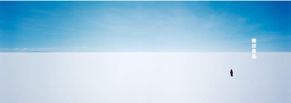
A great example is the Muji campaign that combines the use of empty space and nothingness, with asymmetry and simplicity. It also has a tension that reminds that we are small humans in this vast world. But at the same time, we get the feeling of calmness from the almost tranquil scenery that surrounds the person. What do you think when you see this photo?
Emptiness Works

The principles mentioned before have, naturally, become a deep part of Japanese values and cultural consciousness. This means there is a deep cultural resonance when Japanese people look at an ad that incorporates these concepts. There is a preference for subtle, calm, and understated advertisements. On the other hand, there is an aversion to loud, flashy, and aggressive ads.
A great example of this is Suntory’s ad with Keanu Reeves It’s subtle, uses a lot of negative space, and the only branding on the ad is the bottle of whiskey. This ad was designed to combine the Japanese concept of Wa, or Harmony, craftsmanship, or monozukuri, and Omotenashi, or customer service. All of this comes together well in this picture. I and many in Japan may feel similarly, have all been to a bar that looks exactly like this. So, in some sense there is a localized feel it that could resonate with those that frequent these locations.

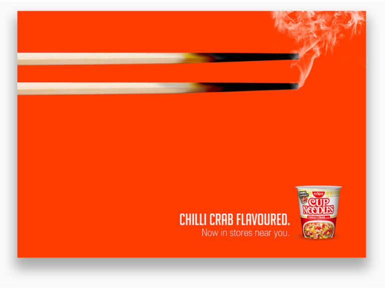
Another reason why emptiness works is it creates an emotional connection. The emptiness creates a contemplative or reflective space to engage with the ad. This invites the viewer to emotionally engage with the ad instead of being bombarded with information. The empty space can also contribute or amplify those emotional experiences. It can also invoke sensory experiences, like this Nisshin Noodle Ad.
When you look at this ad you are automatically drawn to the flaming chopsticks. You are already thinking this is going to be some sort of spicy food. You may start to even feel the heat radiate from the ad or feel the spicy tingle in your mouth. When you look down you see that it is in fact a spicy chili crab flavored noodle cup. This may even add to the sensation as you can add the crab or seafood flavor to the mix. This whole narrative is almost instantly created when you look at the chopsticks without the need of anything being explained to you. You could even get rid of the cup, or the wording and it would still invoke similar feelings. I also feel like the unsung hero is the orange background which adds to the feeling of the heat without distracting from the story being told.

Finally, is the emptiness in ads provides a place of respite. Tokyo and many of the larger cities are crowded and noisy. You are walking around and there are people. Get on the train and your bombarded with busy ads and more people. Have you ever seen the inside of a Don Quijote store, talk about chaos. But that’s why these ads work. Seeing cluttered ad after cluttered ad when you run into this clean simple ad, you automatically focus in on it.
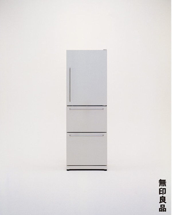
Take this Muji ad for a refrigerator. If you are walking around Tokyo on your way home, you have already been bombed with stimulation from the Don Quijote store, train ads, and chimes in the distance from convenience stores. Your eyes pass by and see this ad and you are automatically refreshed by this simple-looking fridge and feel that sense of respite. A momentary escape from the busyness of the city around you. The white, empty space invites you in and lets your eyes rest as they settle on the fridge. You may notice the brand name or may instinctively know this distinct style as Muji’s work and move on. It may seem insignificant, but that’s why it works and that is why Muji is one of the most successful brands in Japan.
Tips for Global Brands
- Subtlety and Minimalism: Embrace it. It works in Japan and resonates with their values of calm and clarity. Brands like Ikea and Apple do it too. You don’t need to explain all that your products do. Show them.
- Use Negative Space: Using negative space doesn’t detract from your product, it creates impact. Use it to direct attention or create a space to reflect and connect with your brand.
- Cultural Values: Respect Japanese cultural values and embrace them in your ads. Values like harmony, tranquility, and quality with themes of nature or personal care resonate with them.
- Balance: Look for ways you can balance incorporating Japanese minimalism in your ads without sacrificing your identity.
I hope this was insightful. If you like this content, follow me on social media to get the latest updates.